The year was 2015. Back when the obsession was making the thinnest phones out there. Chinese smartphone brands made their presence felt in the race, out-slimming the big boys. Vivo’s crown jewel was merely 4.75mm across.
Even Samsung partook and launched a phone that beat Apple at the cross-section game. A decade later, the wheels of smartphone design are turning back to slim phones.
The rumor mill keeps spilling details about the Galaxy S25 Slim and iPhone 17 Slim. I am hoping the other murmurs about a massive iPhone redesign are also true. It’s high time, Apple.
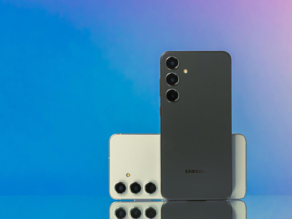
A few reliable leaks have given us our first glimpse of the upcoming Galaxy S25 series phones. They all look, well, the same as the Galaxy S24 series.
The S25 Ultra model seems a tad fresher, but the tweaks are far from groundbreaking. Samsung’s designers rounded off the sharp corners and called it a magnificent day of immense toil. The vanilla and Plus models will only get glass shells in a slightly different shade.
Look at the alleged design “refresh” on the yet-to-be-launched Galaxy S25 Ultra and the entry-level Galaxy A13 side by side. The similarity is evident, but the sides and corner radius set the two phones apart. I know some of our readers are people of spectacular taste in their electronics and have sharp eyes at UX commentary.
I lied. Apologies. There’s no Galaxy S series smartphone in that collage.
What we have here are the Galaxy A16, A05s, and A34 5G smartphones in the same order. The Galaxy A05s, in particular, is over seven times less expensive than the least-expensive Galaxy S24 series phone, which looks nearly identical.
All right, time for some course correction and to juice up the difficulty levels. In the image below, one of the devices is a Galaxy S flagship smartphone, while the remaining two are midrangers from the Galaxy A-series. Take a swing at separating the gold from the grass.
The latter two even adopt a glass-and-metal build and offer a fantastic in-hand experience, just like the Galaxy S24. And the Galaxy S23 before it. And their respective “Plus” trims. To put it simply, one can’t even go with the argument that “the Galaxy S at least feels better.”
The situation is so bad that Samsung even makes Apple look good. The same Apple that continues to sell the iPhone SE, modeled after a phone that was launched all the way back in 2017.
In the image above, you see three different mainline iPhones launched within four years. Apple at least spent some time moving around the camera lenses or switched away from the darn ugly notch to the Dynamic Island aesthetics in that span.
Samsung hasn’t done either. In fact, the Korean electronics giant has only made the situation worse by aping the same look everywhere, from flagships and premium midrangers to entry-level phones.
To exacerbate things, the company further shifted gears and went in the reverse direction with design experiments. Take a look at these two budget-friendly Galaxy smartphones, which cost merely a fraction of the Galaxy S sticker price yet serve more character on their rear shell.
When Samsung launched the Galaxy S22, it paraded bold claims like “Essence of Originality“ and “Bold Geometry.” Next came the Galaxy A-series introduction, tagging alongside the “A is for Aesthetic” punchline.
Here’s the fun part. All of them, even in Samsung’s press assets, look identical. The situation is laughably bad, and it hurts to think that Samsung once made stunning phones with bold color combinations and design language.


